2. Visualization#
Visualizatin is vital in data analysis and scientific computing, to
get intuitive understanding
come up with a new hypothesis
detect a bug or data anormaly
That is why we’ll cover this topic at the beginning of this course.
Matplotlib#
Matplotlib is the standard graphics package for Python.
It mimics many graphics functions of MATLAB.
The Matplotlib gallery (http://matplotlib.org/stable/gallery) illustrates variety of plots.
import numpy as np
import matplotlib.pyplot as plt
Usually matplotlib opens a window for a new plot.
A nice feature of Jupyter notebook is that you can embed the figures produced by your program within the notebook by the following magic command
%matplotlib inline
(It may be a default setting in recent jupyter notebook).
%matplotlib inline
Plotting functions#
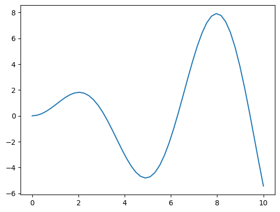
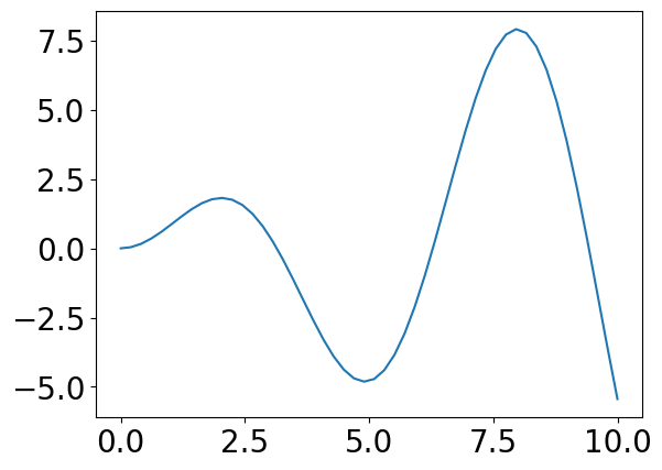
The standard way is to prepare an array for x values, compute y values, and call plot( ) function.
# make an array from 0 to 10, the default is 50 points
x = np.linspace(0, 10)
# comupute a function for each point
y = x*np.sin(x)
# plot the points
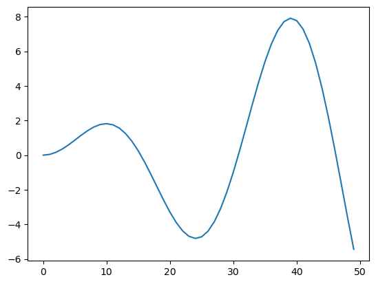
plt.plot(y) # x is the index of y
[<matplotlib.lines.Line2D at 0x11a8a4550>]
There are multiple ways to pass variables to plot():
plot(y): x is assumed as the indices of yplot(x, y): specify both x and y valuesplot(x1, y1, x2, y2,...): multiple linesplot(x, Y): lines for columns of matrix Y
# specify both x and y values
plt.plot(x, y)
[<matplotlib.lines.Line2D at 0x11a9f9090>]
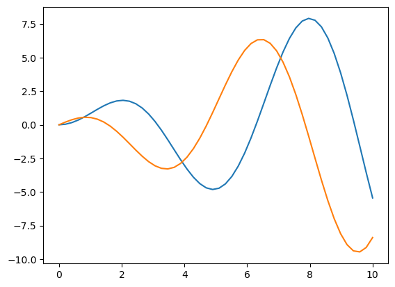
# take another function of x
y2 = x*np.cos(x)
# plot two lines
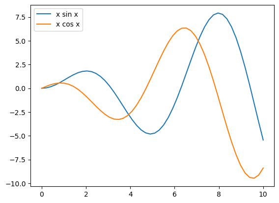
plt.plot(x, y, x, y2)
[<matplotlib.lines.Line2D at 0x11aa807d0>,
 <matplotlib.lines.Line2D at 0x11aa80910>]
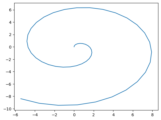
# phase plot
plt.plot(y, y2);
# you can supress <matplotlib...> output by ;
# plot multiple lines by a matrix
Y = np.array([y, y2])  # stack data in two rows
plt.plot(x, Y.T); # transpose to give data in two columns
# plot multiple lines by a matrix
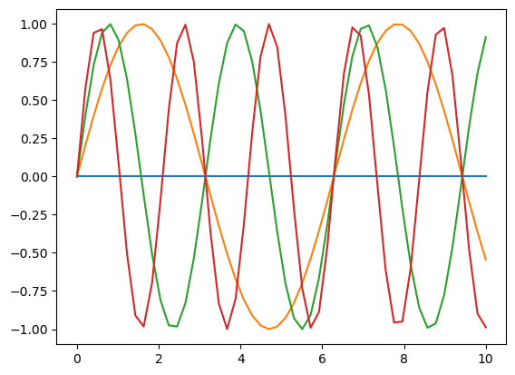
Y = np.array([np.sin(k*x) for k in range(4)])
plt.plot(x, Y.T);
Options for plotting#
Line styles can be specified by
color=(orc=) for color by code, name, RGB or RGBAcode: ‘r’, ‘g’, ‘b’, ‘y’, ‘c’, ‘m’, ‘k’, ‘w’
marker=for marker stylecode: ‘.’, ‘o’, ‘+’, ‘*’, ‘^’, …
linestyle=(orls=) for line stylecode: ‘-’, ‘–’, ‘:’, ‘-.’, …
linewidth=(orlw=) for line widtha string of color, marker and line sytel codes, e.g. ‘ro:’
# using code string
plt.plot(x, y, 'm:', x, y2, 'c*');  # magenta dash-dot, cyan circle
# using keyword=value
plt.plot(x, y, c=[0.2,0.5,0.8,0.5], marker='o', markersize=10, ls='-.', lw=2);
It’s a good practice to add axis lables and plot title.
You can use Latex format by \( \).
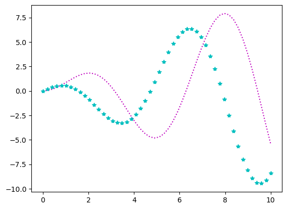
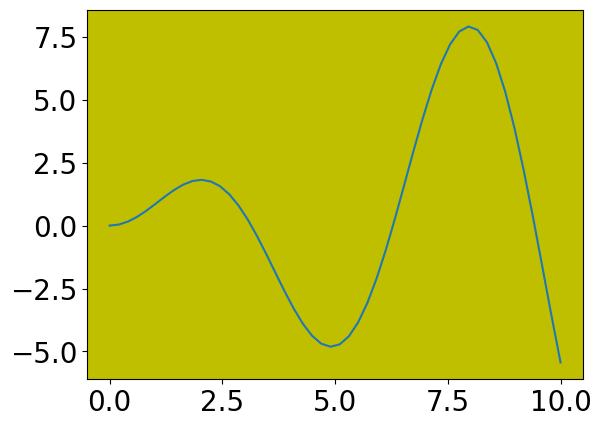
plt.plot(x, y)
plt.title('oscillation')
plt.xlabel('time ($\\mu s$)')  # $ $ for latex code with \\ for symbols
plt.ylabel('amplitude')
Text(0, 0.5, 'amplitude')
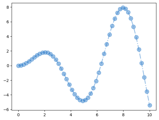
It is also nice to add a legend box.
ax = plt.plot(x, y, x, y2)
plt.legend(('x sin x','x cos x'))  # second line in LaTex
<matplotlib.legend.Legend at 0x11a8af230>
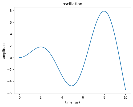
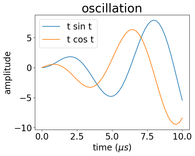
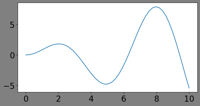
The texts in a figure tend to be too small when included in a slide or a paper.
You can control the default font size by rcParams.update() and specifying fontsize for particular labels.
# set default font size to 20 point
plt.rcParams.update({'font.size': 20})
ax = plt.plot(x, y, x, y2)
plt.title('oscillation', fontsize=28)  # title in 28 point
plt.xlabel('time ($\\mu s$)')
plt.ylabel('amplitude')
plt.legend(('t sin t','t cos t'))
<matplotlib.legend.Legend at 0x11ad7c910>
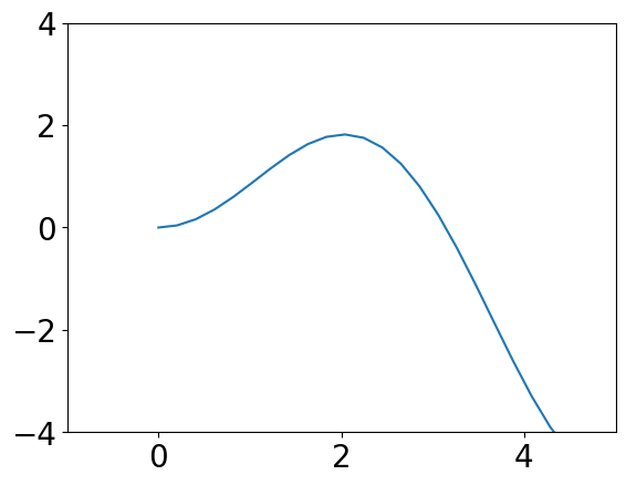
You can control axis ranges and scaling.
plt.plot(x, y)
plt.xlim(-1, 5)
plt.ylim(-4, 4)
(-4.0, 4.0)
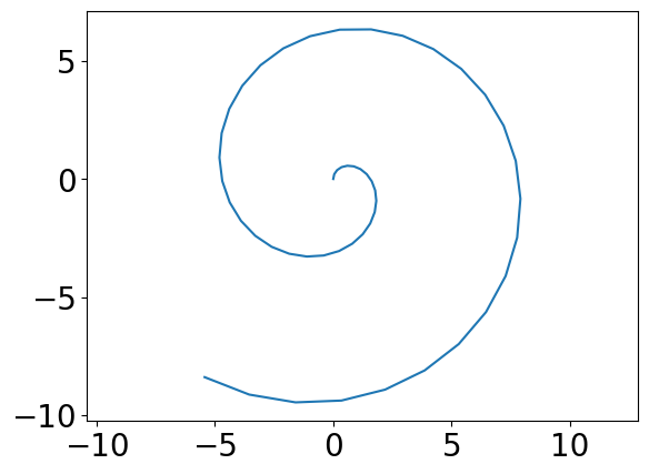
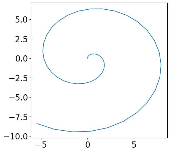
plt.plot(y, y2)
plt.axis('equal')  # equal scaling for x and y
(np.float64(-6.10798067784125),
 np.float64(8.582949839004911),
 np.float64(-10.247801600732576),
 np.float64(7.121229063313089))
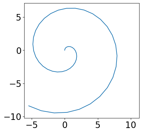
plt.plot(y, y2)
plt.axis('square')  # in square plot area
(np.float64(-6.10798067784125),
 np.float64(11.261049986204412),
 np.float64(-10.247801600732576),
 np.float64(7.121229063313088))
You can create a fiure of your preferred size by plt.figure() function
fig = plt.figure(figsize=(6, 6))
plt.plot(y, y2)
[<matplotlib.lines.Line2D at 0x11ced2210>]
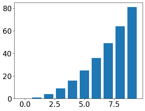
Bar plot and histogram#
i = np.arange(10)
j = i**2
plt.bar(i, j)
<BarContainer object of 10 artists>
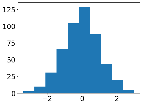
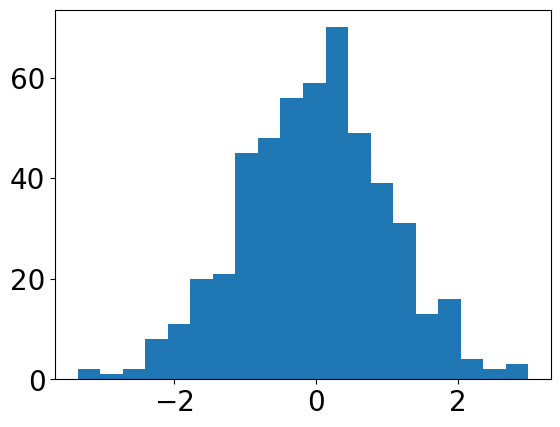
np.random.randn() gives random numbers from the normal distribution
z = np.random.randn(500)
plt.hist(z)
(array([  3.,  10.,  31.,  66., 104., 129.,  88.,  44.,  20.,   5.]),
 array([-3.36115163, -2.72542835, -2.08970507, -1.45398179, -0.81825851,
        -0.18253523,  0.45318804,  1.08891132,  1.7246346 ,  2.36035788,
         2.99608116]),
 <BarContainer object of 10 artists>)
plt.hist(z, bins=20)
(array([ 2.,  1.,  2.,  8., 11., 20., 21., 45., 48., 56., 59., 70., 49.,
        39., 31., 13., 16.,  4.,  2.,  3.]),
 array([-3.36115163, -3.04328999, -2.72542835, -2.40756671, -2.08970507,
        -1.77184343, -1.45398179, -1.13612015, -0.81825851, -0.50039687,
        -0.18253523,  0.13532641,  0.45318804,  0.77104968,  1.08891132,
         1.40677296,  1.7246346 ,  2.04249624,  2.36035788,  2.67821952,
         2.99608116]),
 <BarContainer object of 20 artists>)
Subplot and axes#
You can create multiple axes in a figure by subplot(rows, columns, index).
It uses a MATLAB legacy for index starting from 1.
plt.tight_layout() adjusts the space between axes.
plt.subplot(2, 2, 1)
plt.plot(x, y)
plt.xlabel('x'); plt.ylabel('y')
plt.subplot(2, 2, 2)
plt.plot(y, x)
plt.xlabel('y'); plt.ylabel('x')
plt.subplot(2, 2, 3)
plt.plot(x, y2)
plt.xlabel('x'); plt.ylabel('y2')
plt.subplot(2, 2, 4)
plt.plot(y, y2)
plt.xlabel('y'); plt.ylabel('y2')
plt.tight_layout()
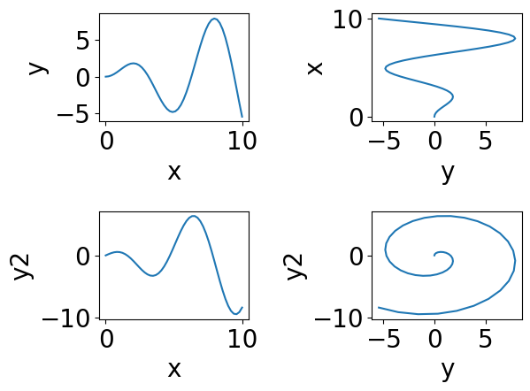
Figure and axes#
When you make a plot, matplotlib creates a figure object with an axes object.
You can use gcf() and gca() to identify them and getp() and setp() to access their parameters.
plt.plot(x, y)
fig = plt.gcf()  # get current figure
plt.getp(fig)  # show all parameters
    agg_filter = None
    alpha = None
    animated = False
    axes = [<Axes: >]
    children = [<matplotlib.patches.Rectangle object at 0x12abcc1...
    clip_box = None
    clip_on = True
    clip_path = None
    constrained_layout = False
    constrained_layout_pads = (None, None, None, None)
    default_bbox_extra_artists = [<Axes: >, <matplotlib.spines.Spine object at 0x12...
    dpi = 100.0
    edgecolor = (1.0, 1.0, 1.0, 1.0)
    facecolor = (1.0, 1.0, 1.0, 1.0)
    figheight = 4.8
    figure = Figure(640x480)
    figwidth = 6.4
    frameon = True
    gid = None
    in_layout = True
    label =
    layout_engine = None
    linewidth = 0.0
    mouseover = False
    path_effects = []
    picker = None
    rasterized = False
    size_inches = [6.4 4.8]
    sketch_params = None
    snap = None
    suptitle =
    supxlabel =
    supylabel =
    tight_layout = False
    tightbbox = TransformedBbox(     Bbox(x0=2.9027777777777715, y...
    transform = IdentityTransform()
    transformed_clip_path_and_affine = (None, None)
    url = None
    visible = True
    window_extent = TransformedBbox(     Bbox(x0=0.0, y0=0.0, x1=6.4, ...
    zorder = 0
plt.plot(x, y)
fig = plt.gcf()
plt.setp(fig, size_inches=(8,4), facecolor=[0.5,0.5,0.5])
[None, None]
plt.plot(x, y)
ax = plt.gca()  # get current axes
plt.getp(ax)
plt.setp(ax, facecolor='y')  # change parameters
    adjustable = box
    agg_filter = None
    alpha = None
    anchor = C
    animated = False
    aspect = auto
    autoscale_on = True
    autoscalex_on = True
    autoscaley_on = True
    axes_locator = None
    axisbelow = line
    box_aspect = None
    children = [<matplotlib.lines.Line2D object at 0x12ab33390>, ...
    clip_box = None
    clip_on = True
    clip_path = None
    data_ratio = 1.3355391378951056
    default_bbox_extra_artists = [<matplotlib.spines.Spine object at 0x12ab30410>, ...
    facecolor or fc = (1.0, 1.0, 1.0, 1.0)
    figure = Figure(640x480)
    forward_navigation_events = auto
    frame_on = True
    gid = None
    gridspec = GridSpec(1, 1)
    images = <a list of 0 AxesImage objects>
    in_layout = True
    label =
    legend = None
    legend_handles_labels = ([], [])
    lines = <a list of 1 Line2D objects>
    mouseover = False
    navigate = True
    navigate_mode = None
    path_effects = []
    picker = None
    position = Bbox(x0=0.125, y0=0.10999999999999999, x1=0.9, y1=...
    rasterization_zorder = None
    rasterized = False
    shared_x_axes = <matplotlib.cbook.GrouperView object at 0x11a8afcb...
    shared_y_axes = <matplotlib.cbook.GrouperView object at 0x12ab334d...
    sketch_params = None
    snap = None
    subplotspec = GridSpec(1, 1)[0:1, 0:1]
    tightbbox = Bbox(x0=2.9027777777777715, y0=15.077777777777776,...
    title =
    transform = IdentityTransform()
    transformed_clip_path_and_affine = (None, None)
    url = None
    visible = True
    window_extent = TransformedBbox(     Bbox(x0=0.125, y0=0.109999999...
    xaxis = XAxis(80.0,52.8)
    xaxis_transform = BlendedGenericTransform(     CompositeGenericTrans...
    xbound = (np.float64(-0.5), np.float64(10.5))
    xgridlines = <a list of 7 Line2D gridline objects>
    xlabel =
    xlim = (np.float64(-0.5), np.float64(10.5))
    xmajorticklabels = [Text(-2.5, 0, '−2.5'), Text(0.0, 0, '0.0'), Text(...
    xmargin = 0.05
    xminorticklabels = []
    xscale = linear
    xticklabels = [Text(-2.5, 0, '−2.5'), Text(0.0, 0, '0.0'), Text(...
    xticklines = <a list of 14 Line2D ticklines objects>
    xticks = [-2.5  0.   2.5  5.   7.5 10. ]...
    yaxis = YAxis(80.0,52.8)
    yaxis_transform = BlendedGenericTransform(     BboxTransformTo(     ...
    ybound = (np.float64(-6.10798067784125), np.float64(8.58294...
    ygridlines = <a list of 8 Line2D gridline objects>
    ylabel =
    ylim = (np.float64(-6.10798067784125), np.float64(8.58294...
    ymajorticklabels = [Text(0, -7.5, '−7.5'), Text(0, -5.0, '−5.0'), Tex...
    ymargin = 0.05
    yminorticklabels = []
    yscale = linear
    yticklabels = [Text(0, -7.5, '−7.5'), Text(0, -5.0, '−5.0'), Tex...
    yticklines = <a list of 16 Line2D ticklines objects>
    yticks = [-7.5 -5.  -2.5  0.   2.5  5. ]...
    zorder = 0
[None]
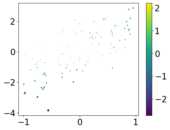
Visualizing data in 2D#
A standard way for visualizing pariwise data is a scatter plot.
n = 100
x = np.random.uniform(-1, 1, n)  # n points in [-1,1]
y = 2*x + np.random.randn(n)  # scale and add noise
plt.plot(x, y, 'o')
[<matplotlib.lines.Line2D at 0x12abf4a50>]
By scatterplot( ) you can specify the size and the color of each point to visualize higher dimension information.
z = x**2 + y**2
c = y - 2*x
# z for size, c for color
plt.scatter(x, y, z, c)
plt.colorbar()
<matplotlib.colorbar.Colorbar at 0x12ac9c050>
Visualizing a matrix or a function in 2D space#
meshgrid() is for preparing x and y values in a grid.
x = np.linspace(-4, 4, 9)
y = np.linspace(-3, 3, 7)
print(x, y)
X, Y = np.meshgrid(x, y)
print(X, Y)
[-4. -3. -2. -1.  0.  1.  2.  3.  4.] [-3. -2. -1.  0.  1.  2.  3.]
[[-4. -3. -2. -1.  0.  1.  2.  3.  4.]
 [-4. -3. -2. -1.  0.  1.  2.  3.  4.]
 [-4. -3. -2. -1.  0.  1.  2.  3.  4.]
 [-4. -3. -2. -1.  0.  1.  2.  3.  4.]
 [-4. -3. -2. -1.  0.  1.  2.  3.  4.]
 [-4. -3. -2. -1.  0.  1.  2.  3.  4.]
 [-4. -3. -2. -1.  0.  1.  2.  3.  4.]] [[-3. -3. -3. -3. -3. -3. -3. -3. -3.]
 [-2. -2. -2. -2. -2. -2. -2. -2. -2.]
 [-1. -1. -1. -1. -1. -1. -1. -1. -1.]
 [ 0.  0.  0.  0.  0.  0.  0.  0.  0.]
 [ 1.  1.  1.  1.  1.  1.  1.  1.  1.]
 [ 2.  2.  2.  2.  2.  2.  2.  2.  2.]
 [ 3.  3.  3.  3.  3.  3.  3.  3.  3.]]
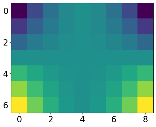
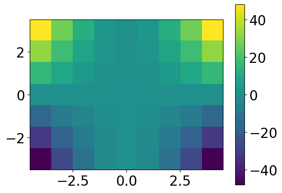
We can use imshow() to visualize a matrix as an image.
Z = X**2 * Y
print(Z)
plt.imshow(Z)
[[-48. -27. -12.  -3.  -0.  -3. -12. -27. -48.]
 [-32. -18.  -8.  -2.  -0.  -2.  -8. -18. -32.]
 [-16.  -9.  -4.  -1.  -0.  -1.  -4.  -9. -16.]
 [  0.   0.   0.   0.   0.   0.   0.   0.   0.]
 [ 16.   9.   4.   1.   0.   1.   4.   9.  16.]
 [ 32.  18.   8.   2.   0.   2.   8.  18.  32.]
 [ 48.  27.  12.   3.   0.   3.  12.  27.  48.]]
<matplotlib.image.AxesImage at 0x12ac9c830>
# some more options
plt.imshow(Z, origin='lower', extent=(-4.5, 4.5, -3.5, 3.5))
plt.colorbar()
<matplotlib.colorbar.Colorbar at 0x12ad86990>
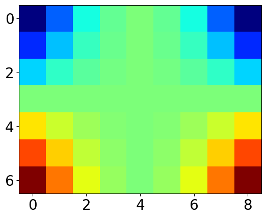
color maps#
imshow( ) maps a scalar Z value to color by a colormap. The standard color map viridis is friedly to color blindness and monochrome printing. You can also choose other color maps.
plt.imshow(Z, cmap='jet')
<matplotlib.image.AxesImage at 0x12b618f50>
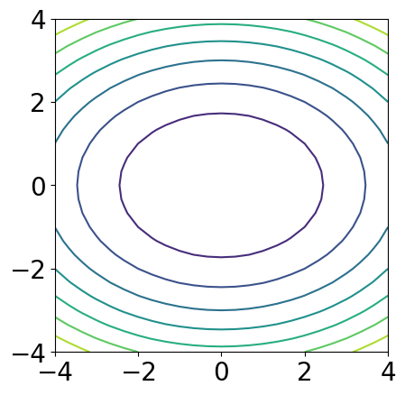
contour plot#
x = np.linspace(-4, 4, 25)
y = np.linspace(-4, 4, 25)
X, Y = np.meshgrid(x, y)
Z = X**2 + 2*Y**2
plt.contour(X, Y, Z)
plt.axis('square')
(np.float64(-4.0), np.float64(4.0), np.float64(-4.0), np.float64(4.0))
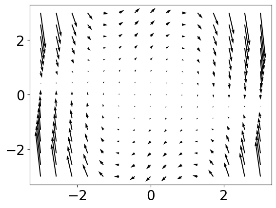
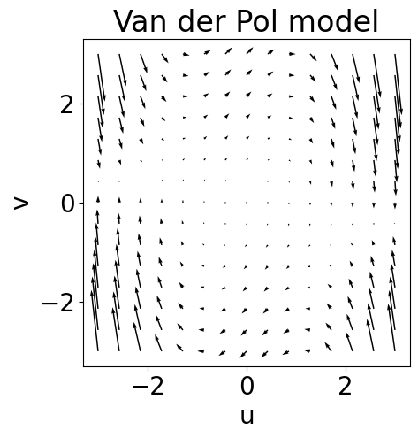
vector field by quiver( )#
x = np.linspace(-3, 3, 15)
y = np.linspace(-3, 3, 15)
X, Y = np.meshgrid(x, y)
# Van del Pol model
k = 1  # paramter
U = Y  # dx/dt
V = k*(1 - X**2)*Y - X  # dy/dt
plt.quiver(X, Y, U, V)
<matplotlib.quiver.Quiver at 0x12ac9d010>
Saving the image#
You can save a plot as a .png file by right-clicking it and choosing a pop-up menu like “save image as …” by the browser.
You can use plt.savefig() function to save it in other formats.
plt.quiver(X, Y, U, V)
plt.title('Van der Pol model')
plt.xlabel('u')
plt.ylabel('v')
plt.axis('square')
plt.savefig('VdP.pdf')
!open VdP.pdf